Your e-commerce business is starting off and you are probably generating some monthly sales. Good job, you are beginning your journey in e-commerce! But you have the potential to generate even more sales. The key is mobile users. Companies like Google have reported that mobile device searches outpaced desktop searches.
Research shows that 58% of website visitors come from mobile devices. If your website doesn’t adapt to mobile users, you will lose a huge portion of your customers. However, the bounce rate is 67%.
Why is this significant? The percentage of mobile users is constantly increasing throughout the years. But these users typically either encounter non-mobile friendly interfaces or do not find what they wanted, which results in a high bounce rate. You will see something similar when you check your statistics.
You can still bounce back if you prioritize developing a mobile-friendly website.
It isn’t too hard to create a mobile optimized website. So how do you start? Luckily, we have the perfect mobile commerce guide.
Why is Mobile Commerce Important?
Personalize Customer Experience
Improve Your Customer’s Checkout Experience
Why is Mobile Commerce Important?
First, let’s start with the basics. What is mobile commerce (m-commerce)? M-commerce is when customers can conveniently purchase products on their mobile devices anywhere as long as they have internet access.
Now let’s imagine that you want to purchase the same shirt as your favorite Instagram celebrity is wearing and you don’t have access to your computer. You can simply go on your phone, add it to your cart, and finalize your purchase. You have just participated in m-commerce. This changes the game for traditional e-commerce because of how accessible purchasing is on your phone.
But why is this important to you? Because you can sell your products to customers anywhere at any time. With a couple of taps, customers can complete their purchase and the money goes to you.

M-commerce isn’t just a fad. It is the way of the future and numbers prove that m-commerce will continue to grow. Almost half of US e-commerce sales are done on mobile devices because of the increase in smartphone and mobile users. Here’s proof from Statista if you don’t believe me. M-commerce sales in 2018 were 39.6% and projected to grow to 44.7% in 2019. In 2021, it is estimated that over half of e-commerce sales will be done on mobile devices. This upward trajectory should further prove how important a mobile-optimized website is for any company wanting to take their sales seriously.
I bet you’re excited to see what m-commerce can do for your sales, but first, you need a mobile-optimized website. I compiled a list of improvements you can immediately make to your website to further improve its mobile experience and subsequently, your conversion rate.
Personalize Customer Experience
What is great about mobile devices is that you are provided with the customer’s phone information such as their location, device type, and demographic. This allows you to collect more specific details such as gender, language, and age to create a personalized user experience. Any e-commerce business owner knows that a more personalized sales message produces better results.
You can target customers based on their specific location with this knowledge. If you are a local business, make sure to mention that you are a local business. Mobile users want local businesses. Customers are more willing to trust companies in their neighborhood. Even if you don’t have a brick and mortar location, location tracking is still important to your business. You can know where your customers live, local weather, and local brands by knowing their location.
This should be a no brainer, but remember to ask for permission when accessing your customer’s location.
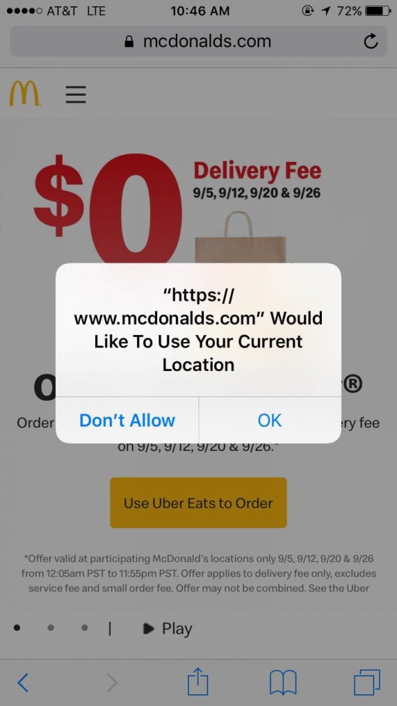
You can also provide them with their estimated shipping time or show your brick and mortar store locations within your customer’s vicinity.
I love mobile coupons and I assume your customers love them just as much. They are easy to keep track of and customers can pull it up on their phone to claim their deals. This creates further incentive for them to revisit your website.
You can also create a personalized offer for your customers based on their location. If their customer’s location experiences some kind of heatwave, an ice cream company would offer them a coupon for a buy one get one free deal in the form of a virtual coupon. It’s a deal that seems impossible to pass up. Who doesn’t want free ice cream to beat the heatwave?
Improve Page Load Time
Slow loading speeds drive customers crazy. They don’t want to wait for your page to load, so guess what they will do? They will exit your website and result in no products being purchased. Nobody wants to wait for anything and this is especially important in a customer’s purchasing journey.
Google Analytics, Google's Page Speed Insight Tool, and Think with Google are tools that measure your page loading speed. You can use this data to help optimize your loading time and figure how to speed it up.
You have to remember that on mobile, internet connection is slower. Even though it might load decently well on your desktop, mobile devices might not necessarily be the same.
You can also use Google’s Mobile-Friendly Test Tool to see if your website is mobile-friendly.
What exactly can you do to reduce load time?
- Eliminate unnecessary words. Don’t clutter your website by being too wordy. Customers don’t want to read them and it will only slow down your load speed.
- Remove popups for your mobile website. Popups are a distraction for customers that are focused on looking for what they want. Popups are also difficult for mobile users to close.
- Keep your website minimalistic. It doesn’t matter how fancy your website looks. If it doesn’t load, people will leave. Your website loading time is just as important as how it looks. Excessive codes that make your website look good, might weigh down your site. This results in slower loading speed.
- Images are some of the most demanding parts of your site, so use as few as possible. Don’t get me wrong, images are great in offsetting lengthy texts and provide value to your overall webpage, but they take up a lot of space. You can always compress the remaining important images. Compressing your pictures helps to reduce the size of the image without affecting the quality. Optimizilla has a great image compressor tool that I personally use and it works almost instantly.
- Avoid redirects as much as possible. Redirects force the website to go to another page in order to retrieve that data. It means that every image and file has to go through the redirect in order for that page to open. And you know what that means? It takes a couple of extra seconds for the website to open and by that time your customer is gone.
Reduce Purchasing Friction
A great mobile experience helps to reduce the steps your customers need to take from their initial customer visits to finalizing the purchase.
What you can do is have fewer form fields for them to fill out. Don’t clutter your forms and only ask them for the most important information. Your customers shouldn’t feel like they are in interrogation for them to purchase their items. It's easier to leave the website than it is to answer a ton of questions. Don't let that happen.
Also, make what form fields you have left easier for your customers. Follow these tips to further reduce friction with filling out forms.
- Create proper spacing between form fields. You need to consciously provide enough space for customers to click between form fields. You should also reduce unnecessary space. There should be a point where your customers can comfortably maneuver around the form. It is important for you to constantly test and see what works.
- Remove autocorrect feature for names and addresses with the code <input type=“text” autocorrect=“off” />. There are multiple variations of names and addresses, customers would become frustrated if you are telling them how they should spell their name or where they live.
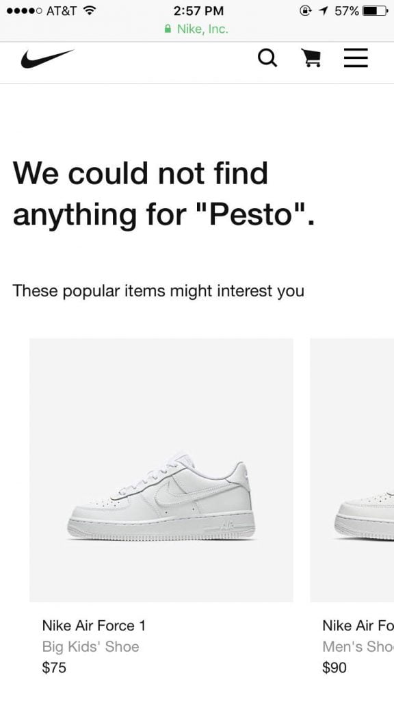
Allow your search bar to handle misspellings and synonyms. Customers will be discouraged if they don’t see what they searched for and leave the site.
Another technique is to provide an alternative for “no results”. “Did you mean…" or “These items might interest you” are good options to help users to continue their shopping experience and provide them with an alternative to checkout.
Your website needs to adapt depending on the user’s screen size. Mobile devices vary in screen dimensions, so your website should change with the screen size. If you don’t, certain parts of your website would be cut off. Your website won’t perform the way you want.
You should also be concerned about visibility. Write in a font big enough, so that customers aren’t forced to zoom in to see your content. Google recommends a base font size of 16 CSS pixels. This is visible and helps to reduce your website’s overall load speed. If they can’t see what you have to say then why would they purchase from you?
Fix Your Layout
Placement is important in your customer’s experience.
You need to keep important information above the fold. This means that important information customers would want to see shows without having to scroll down. Some examples of important information include your brand logo, unique selling propositions what your company is about, simple navigation, and a call to action.
Why is keeping your information above the fold important?
Customers spend the majority of their time here. It is what people see first and it attracts the most attention.
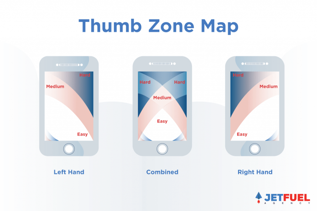
It is important to remember that mobile customers use their thumbs on their devices. There are areas on the screen that is harder for them to get to, so place important functions accordingly. Thumbs are bigger than mouse pointers, so important functions need to be big enough for them to comfortably tap on.
In the picture below, the “natural” area is where users are the most comfortable in maneuvering their thumbs. “Stretch” section is where there is a minor difficulty in maneuvering your thumb in that section. The “hard” area is where your customers have a difficult time reaching that section. Be mindful of where you want to place these functions. Sometimes, it is best to place functions in the hard to reach areas such as shopping cart. This allows it to be noticeable, without being in your customer’s way.
One important thing to remember is that phone sizes vary based on devices. People own all kinds of different devices from iPhones to Androids, but even in the iPhone category, different iPhone versions have different screen sizes.
Mobile customers love to scroll up and down to get a feel of the websites before they look deeper into what you have to offer. The homepage needs to be scannable because this is your first impression to customers. Be mindful of your customer's eye path. Your customer's interaction with your website isn’t random. There’s usually a pattern and your layout helps to establish that eye path.
There are simple functions you can add to your website to further increase conversion.
- Have your call to action displayed boldly on their screen. Customers tend to convert better when they are told what to do.
- A shopping basket icon at the top that also displays the number of items added to the cart will help to increase conversions. The icon will help your customers locate where to checkout and see how many items they have in their cart. Just like shopping in a grocery store, customers love to physically see the items they are about to purchase.
- A top menu navigation function will further help reduce friction. If customers want to see more, they can click on it to expand. The menu is on top because it’s easily accessible when they need it, but it also won’t be in their way when they simply scroll up and down the page.
These little things add up to create the best user experience possible for your customer. Don’t underthink anything. Every tiny button is important for mobile devices because the screen size is not as big as a desktop screen.
Optimize Your Images
Images might be more important than texts for customers. They are highly visual and helps to break up the monotony of long texts. But just like anything on a website, images need to be optimized to create a better mobile user experience.
Let’s start with some basic tips. They may seem like common sense, but you would be surprised by how many websites are still making these mistakes. You need to provide detailed views of the products, keep images proportional to other important website elements, and avoid product image ambiguity. Images that follow these 3 rules provide value which is always better than a large number of bad images. Quality over quantity.
A key feature in mobile devices is that they could turn to its side, activating landscape mode. This stretches out everything and will affect your images, so you should scale product images proportionally when switching modes.
You should honor all image gestures because mobile functions differently than desktops. Desktop users can simply use the scroll wheel on a mouse to zoom, but for mobile devices, you would need to pinch to zoom. Another image gesture would be to swipe to see the next or previous image.
As mentioned above, remember to compress your images to reduce load speed. Images take up a huge portion of processing space, so this step is extremely vital in your efforts to create a mobile-friendly website.
Now we can go over image descriptions. You should remember to have adequate secondary product info and specs. Product descriptions should be bite-size and scannable. Nobody wants to read big blocks of texts. You should have all product specs in the spec list even if addressed in the product description.
Always Upsell and Cross-sell
Upselling and cross-selling will help you sell more products to your customers.
Upselling is when you ask if your customers want a bigger size or an increased quantity. An example would be that you can buy 2 rolls of toothpaste for $8 or 4 rolls of toothpaste for $14. Who doesn’t want more of that product at a cheaper price?
Cross-selling is when you offer similar products.
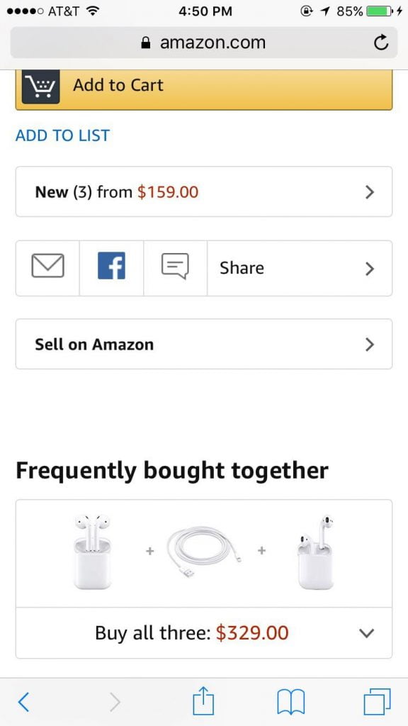
Offer a list of compatible products on the bottom. If your customers are looking at one of your products, you can make a sale by showing similar products or compatible products.
Introduce customers to what else you have to offer.
Most e-commerce sites do this but don’t overwhelm your customers when they are on their mobile devices. Remember their screens are small, so don’t clutter it.
Improve Your Customer’s Checkout Experience
Include a progress bar for checkout. You don’t want customers to think the checkout process is too long. The progress bar will allow customers to be updated and know exactly how much longer it is for them to complete the checkout process.

Your checkout as a guest option needs to be on top. This allows for higher visibility. Customers do not necessarily want to sign up for an account on your website. They might want to purchase their items and leave. Customers might feel forced to sign up without a guest option and this will stop them from continuing further.
There are 2 solutions to this issue.
- Place the guest checkout option at the top with its own button to proceed, so users don’t need to fill an email field. You can also do an existing account lookup at the next step when you ask for their email to ensure account holders do not use guest checkout just because it is the first option on the list.
- Collapse all fields and descriptions for all 3 options: guest checkout, sign in, and create an account. It will dynamically expand when tapped.
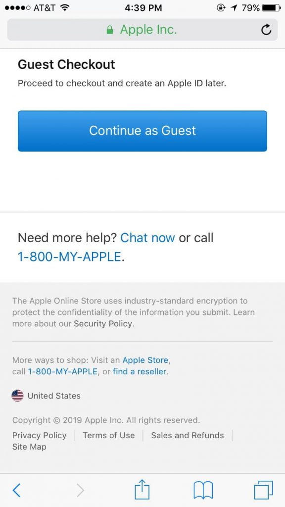
Do not precheck your newsletter option because customers will see it as sneaky. Sneaky is never good.
Explore an Omni Channel Approach
An omnichannel approach allows your customers to continue their shopping experience on multiple devices. This helps to further establish the sense that customers have the freedom to purchase anywhere at any time. Customers love how companies are able to combine multiple channels to create a cohesive shopping experience.
An example of a company with a great omnichannel experience is Sephora. Sephora connects its customers’ online purchases to their in-store visits when they sign up for their “Beauty Bag” account. They can add a product to their wishlist and they can choose to purchase the product on any device or even in the store.
A well established mobile website helps to create one aspect of the omnichannel approach. Customers can begin their purchasing journey on a desktop and finalize their purchase on their mobile device.
Your Turn
Mobile commerce is growing at an exponential rate, so neglecting your site’s mobile experience will be a detriment to both your brand and sales. On the other hand, the brands that effectively execute on their mobile optimization strategies would reap the rewards in the form of increased conversion rates and sales.
The tips and tricks above should make for a solid starting point for optimizing your mobile experience. This will never take the place of actionable, clean data in your analytics platforms, which would guide you even further along your mobile optimization journey.
Feel free to share your favorite mobile optimizations or improvements to the ones listed above!
