Most food and beverage websites lose half their visitors in the first 15 seconds. What’s driving them away? The answer might surprise you.
Imagine a customer craving your beef jerky or gluten-free cookies but bouncing off before ordering because your site was too confusing. Or, picture this: A busy executive browsing your site during lunch break. Will they find what they need quickly, or move on to a competitor?
Research from Stanford University indicates that 75% of consumers judge a brand’s credibility based on its website design. Are you making the right impression?
To help you answer all these questions and boost your sales, we’ve put together a series of blog posts about tips for effective website design for food & beverage e-commerce businesses. Think of it as your roadmap to e-commerce success. In this series, we’ll cover everything from intuitive navigation and high-quality visuals to converting product pages, mobile-first design, lightning-fast performance, and secure transactions.
Together, these elements create a strong foundation for a successful food e-commerce site that meets the ever-changing demands of consumers and the industry.
Ready to take your food e-commerce game to the next level? Let’s get started.
What Is Website Design?
Design is not just what it looks like and feels like. Design is how it works. - Steve Jobs
Steve Jobs nailed it with this quote. Website design isn't just about looking good; it's about creating an easy, smooth user experience. It’s everything from layout and colors to fonts, images, and how interactive elements work together to tell your brand’s story.
For food and beverage websites, effective web design is crucial. Your site needs to be welcoming, professional, and easy to navigate, just like a physical store. A well-designed site builds trust, engages visitors, and turns them into loyal customers. It should appealingly showcase your products, provide clear information, and make the purchasing process seamless.
Did you know that 70% of consumers abandon their online shopping carts due to poor user experience, including website navigation? In this article, the first in the series, we'll break down the key elements of effective website navigation and share practical examples and bonus tips to make sure your site looks great and works even better.
Stick with us as we dive into how to create a website navigation that truly serves your business goals, and gives users a top-notch experience. Whether you’re just starting out or looking to up your game, this guide will provide you with the tools you need to boost your online presence and succeed in the digital world.
Tip #1: Website Navigation
| Navigation refers to the system that allows users to move around your website. It's like a roadmap guiding visitors to find what they need quickly and easily. Effective navigation is crucial for keeping users engaged and driving conversions. |
Simple navigation on food e-commerce websites makes it much easier for customers to find what they need, boosting their overall experience. Besides, a user-friendly navigation system can bump up conversion rates by as much as 18.5%. This happens because a straightforward and intuitive layout lowers the bounce rate, which helps with website optimization and boosts search rankings.
When your site's navigation is clear and logical, users are more likely to explore more pages, spend more time on your site, and make the conversion. For example, having a well-organized main menu and clear category labels keeps users from feeling lost and leaving your site.
But, how to choose which links to put in your menu bar? How to organize the menu labels? Which menus are the best for food and beverage businesses?
Keep reading, as we answer each of these questions, and provide real-life examples from the food industry.
How to Choose and Organize the Menu Items?
Food and beverage e-commerce websites often have a lot of categories, types of services, and other pages, and picking which ones to put to your main navigation can be tricky.
First impressions matter. When visitors land on your homepage, the first links they see can shape their entire browsing behavior. So, let's try to think like a website visitor because everything on your site should be there for a purpose. And the purpose is to help the visitor become your customer in as few clicks as possible.
When choosing menu items, the safest way would be to first check your GA4 data and discover which pages are the most valuable for your business. Next, identify which categories these pages belong to. These would probably be the ones that deserve to be highlighted in your top navigation.
| Putting your most crucial links and a call to action in the main navigation will take the visitors in the right direction to completing their (and your!) goal. |
But, how should you organize the menu items? Knowing that people recall the first and last items in a list more effectively than those in the middle (the Serial Position Effect), it makes sense to apply that to website design, too. So, placing your most critical links at the beginning and end of your menu can make them more memorable and accessible to users.
Finally, reducing the number of choices can prevent decision fatigue, which occurs when users are overwhelmed by too many options, leading to frustration and potential site abandonment. Choosing from 3 to 6 items to include in your main navigation would be the best way to go.
How to Label Your Menu Items?
When it comes to navigation labels, clarity is king. Keep it simple—use clear, descriptive labels that tell users exactly what they'll find when they click.
Again, think like your customer, asking: What do I want to find? Your customer is most likely not looking for 'products' or 'services'. They are certainly looking for a specific product, be it 'chocolate bars' or 'vegan cookies'. Or a specific service, such as 'catering' or 'lunch to go', or they just want to 'shop now'.
Let's look at these 2 navigation bars to help you visualize. The first one uses generic navigation labels, like millions of other sites:

The second website uses descriptive menu labels, specific to their product range and business type:

Lastly, to customize your menu labels, ditch the jargon and techy terms that can confuse visitors. Instead, choose familiar words and phrases that your audience will instantly get. This not only makes your site easier to use but also gives your SEO a nice boost by making your navigation more search-engine friendly.
Design Tips for Effective Navigation
To design an effective navigation system, start by ensuring that the navigation bar or menu bar is easily visible and consistently placed across all pages. There are seven types of navigation bars that work best for our food and beverage clients:
- Standard Horizontal menu
- Hamburger menu
- Mega menu
- Hover menu
- Vertical sidebar
- Breadcrumb navigation
- Footer menu
Let’s define these menu types and look at some interesting real-life examples for each of them and help you choose the right one for your business.
Standard Horizontal Menu
Ever notice how some websites just feel natural to use?
The secret often lies in their horizontal navigation menus, which streamline access to essential sections.
Horizontal navigation menus are placed at the top of a webpage, guiding users to key sections like Home, About, Contact, Blog, and Services. They expand when hovered over or clicked, revealing more options and sometimes featuring extras like search bars, contact info, or language choices.
| Horizontal menus are perfect for food and beverage websites because they offer a straightforward, familiar navigation style. |
For instance, a coffee shop website can use a horizontal menu to prominently display links to its menu, locations, online store, and customer reviews. This helps users find exactly what they need quickly, whether they’re looking to place an order, find a nearby location, or read reviews.
Implementing horizontal menus can significantly improve user experience, leading to higher engagement and lower bounce rates. By making navigation easy and intuitive, horizontal menus help ensure that potential customers stay on your site longer, explore more of your offerings, and are more likely to make a purchase.
See how the Perfect Snacks site effectively uses a classic horizontal navigation bar for desktop visitors:
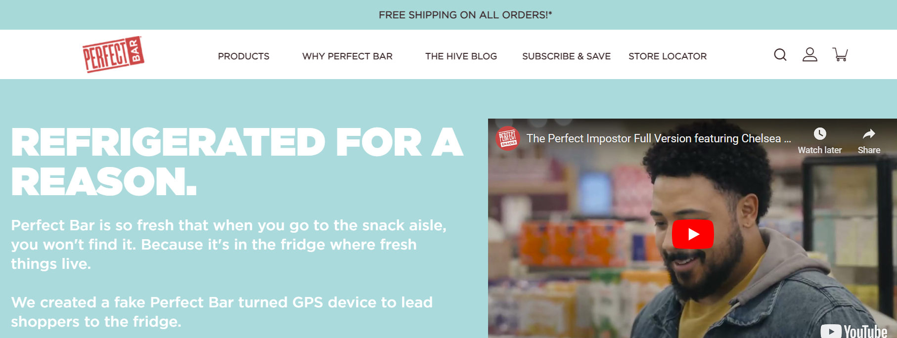
| Bonus tip: Making your navigation bar sticky can improve your website performance. It keeps key links always in view, so users don’t have to scroll back up to navigate, making their visit smoother and more engaging. Plus, by reducing navigation hassle, you boost the chances of visitors moving between pages and making purchases, upping your conversion rates and average order value. |
Hamburger Menu
On smaller screens, horizontal menus usually transform into a hamburger button. Hamburger menus are a popular navigation design used primarily on mobile websites and apps, though they are also seen on desktop sites. Represented by a simple icon with three horizontal lines (resembling a hamburger), this menu expands to reveal navigation options when clicked or tapped.
| Hamburger menus are ideal for food and beverage websites that need to maintain a clean and uncluttered design, especially on mobile. |
If your site has numerous categories or products, a hamburger menu is a smart choice. It can improve UX and lead to longer browsing times and higher engagement, ultimately increasing the likelihood of conversions and customer satisfaction.
Check out how the Perfect Snacks site uses a hamburger menu on mobile screens:
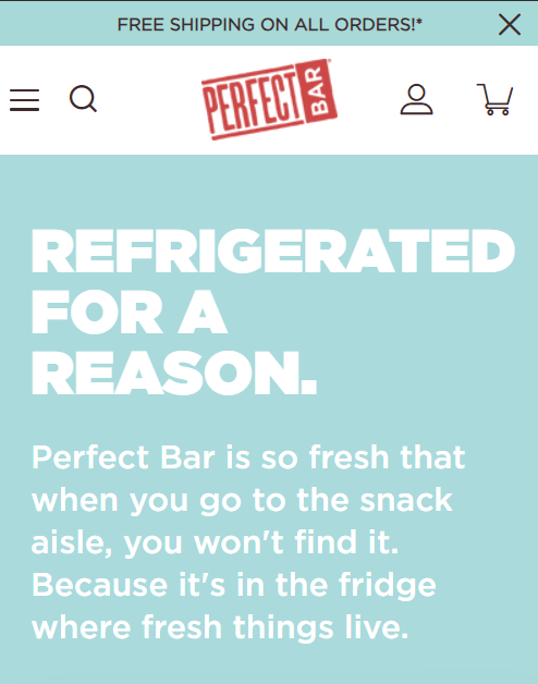
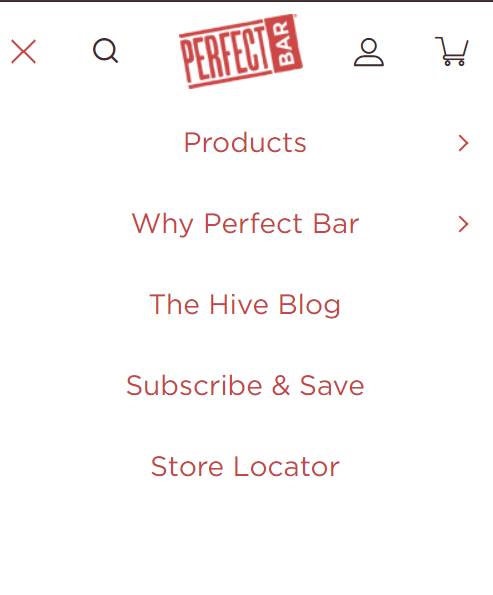
| Bonus Tip: Keep the hamburger menu accessible as users scroll by making it sticky. This ensures that navigation options are always within reach. |
Mega Menu
A mega menu is a super-sized menu that shows all categories or products at once, making it easy for users to find what they need with just a click. It’s a fantastic choice for food and beverage e-commerce sites, as it can greatly enhance user experience and boost the visibility of all your products, leading to higher conversions.
For example, Chomps is using a mega menu dropdown to showcase its jerky product selection after clicking on Shop on the horizontal menu. The ability to see all options at a glance saves time for users and makes the shopping process more efficient, encouraging them to make more purchases and boosting their satisfaction.
Check it out:
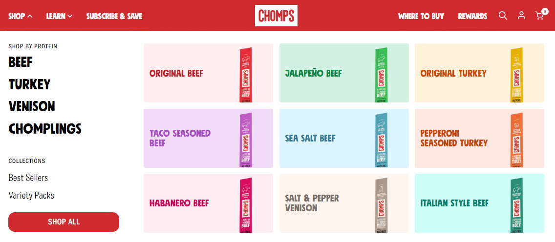
| Bonus Tip: To make your mega menu even more effective, consider adding icons or product images. This not only makes the menu more visually appealing but also helps users quickly identify categories and products, improving overall navigation and user experience. |
Hover Menu
Hover menus make your website super easy to navigate by showing extra options when you hover over a menu item—no clicks needed! This keeps your site looking clean and organized, with all the important stuff hidden until you need it. Plus, the smooth animations make using your site feel more natural and fun. It’s all about giving your visitors a quick, easy, and engaging way to find what they’re looking for.
Check out how Tate’s Bake Shop uses this effect to show subcategories for their sections, such as Cookies, without requiring the visitors to click:
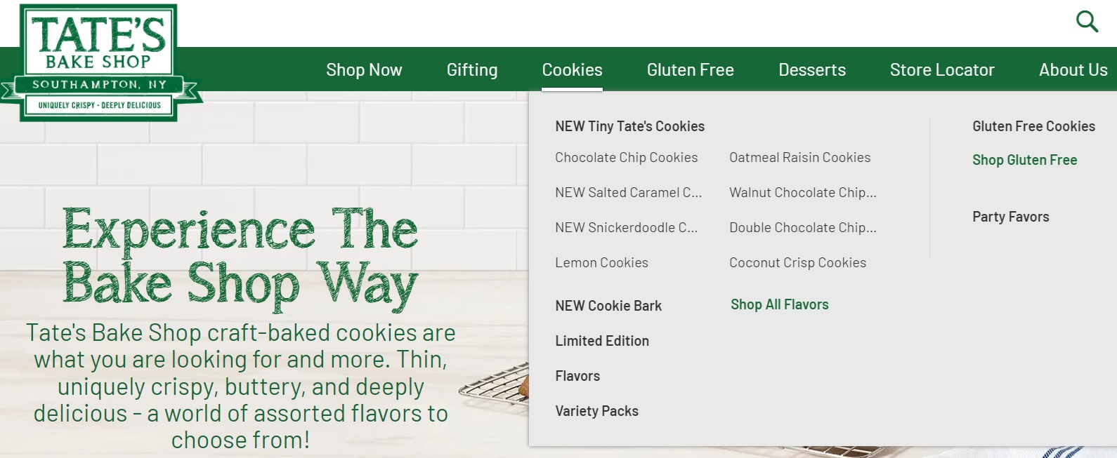
| Bonus tip: The hover effect doesn’t work well on mobile devices, as it's challenging for a responsive design. So, be aware that you can add this effect to your desktop version only. |
Breadcrumb Navigation
Breadcrumbs might sound like something you'd find in your pantry, but on a website, they’re a game-changing navigation tool. They show users their location on a site, helping them understand where they are and easily navigate back to higher-level pages. This is super useful for food and beverage e-commerce sites with lots of product categories and types.
Breadcrumbs also boost SEO by giving search engines more context about your site’s structure, leading to better indexing and higher search rankings. Plus, they encourage users to explore more of your site, boosting engagement and conversion rates.
Picture an online chocolate shop where you’ve clicked through to the Milk Chocolate section. Breadcrumbs like Home > Shop > Categories > Chocolate Bars > Milk Chocolate help users see their path and navigate back to broader categories easily. This improves usability and satisfaction by reducing frustration and making navigation more intuitive.
Here's how the Theo Chocolate website uses breadcrumb navigation on mobile devices:
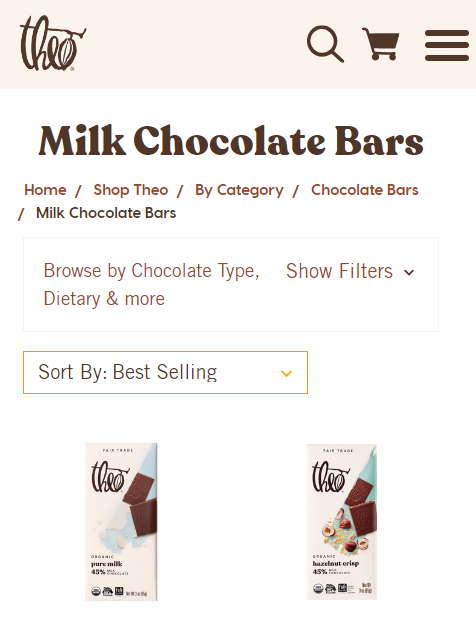
| Bonus tip: To make breadcrumbs effective, keep them simple and clear, and make sure each element is clickable. Consistency is key—place breadcrumbs in the same spot on every page and start with a link to the homepage. Also, ensure they’re responsive so they look good on all devices. |
Vertical Sidebar
While not as common as horizontal menus, vertical sidebars can work wonders for food and beverage sites. Vertical menus keep your site organized and user-friendly by neatly tucking navigation links to the side.
They’re great for sites with lots of categories, as they save space, scale easily, handle long names better, and make all options visible without dropdowns. Consistent visibility enhances the user experience, ensuring navigation is always just a glance away.
| Vertical sidebars are most effective when paired with horizontal menus to show additional filters and search options, making it easier for users to find exactly what they need quickly and efficiently. |
For example, Theo Chocolate pairs vertical navigation with a horizontal main menu to keep its vast product categories organized and accessible. On top of that, they are offering different filter options, such as type, dietary, size, and collection.
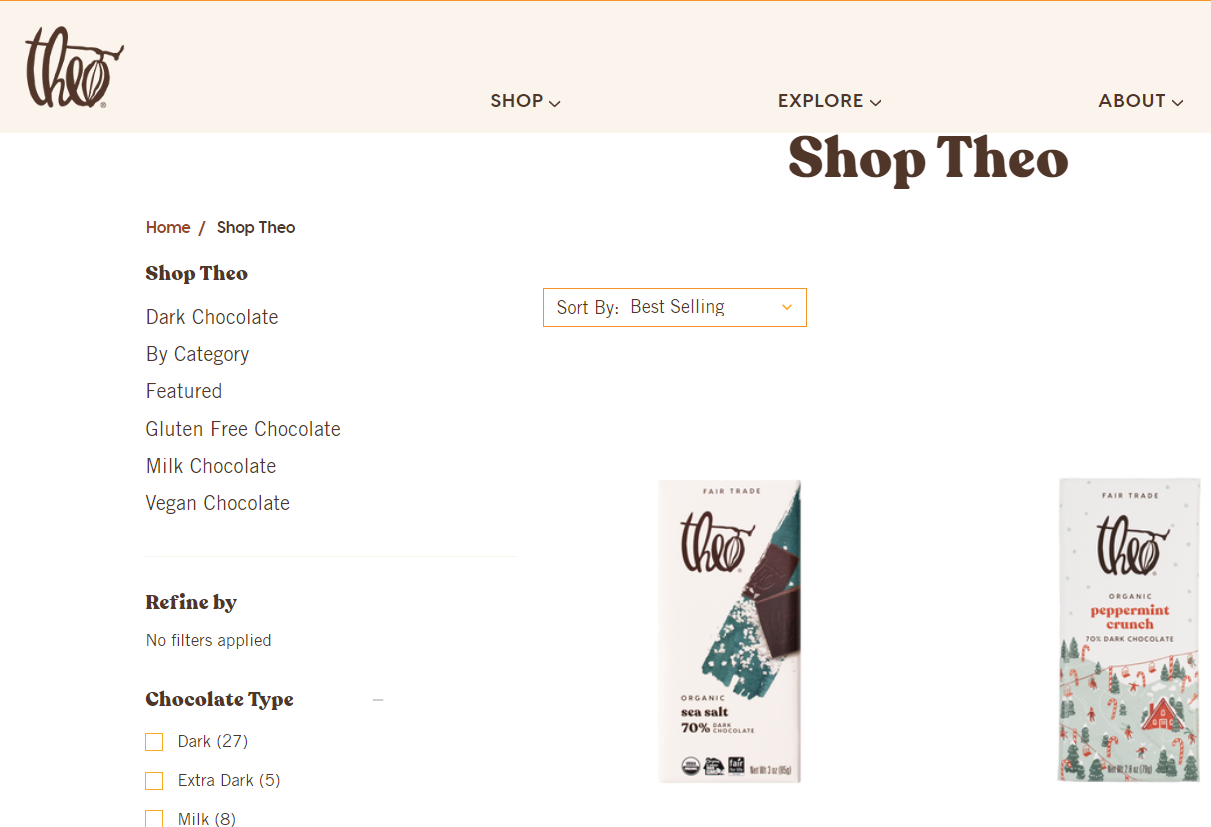
| Bonus tip #1: Combine vertical sidebars with horizontal menus to boost user experience by giving visitors multiple ways to navigate. Bonus tip #2: Include filtering options in the side menu to remove friction, improve user interaction, and increase conversion rates. |
Footer Menu
Did you know that a well-optimized footer can drive 50% more conversions?
That alone should be a good enough reason to use its potential to the max when designing your website.
A footer menu is a navigation element placed at the bottom of a webpage. It typically includes links to important but less frequently accessed pages without cluttering the main menu, like contact information, privacy policies, and social media profiles.
The footer menu is a practical way to help visitors find what they need, no matter where they are on the page.
| Footer menus are a great complement to the standard horizontal or sidebar menus. They are ideal for food and beverage sites that need to pack in lots of info without cluttering the main navigation. |
For example, Bobbie's footer menu includes links to their shop, order tracking, community, company story, affiliates, wholesale, and so much more. This keeps the top navigation simple and focused on primary actions like ordering or viewing the menu. At the same time, users can quickly find what they need after browsing the main content.
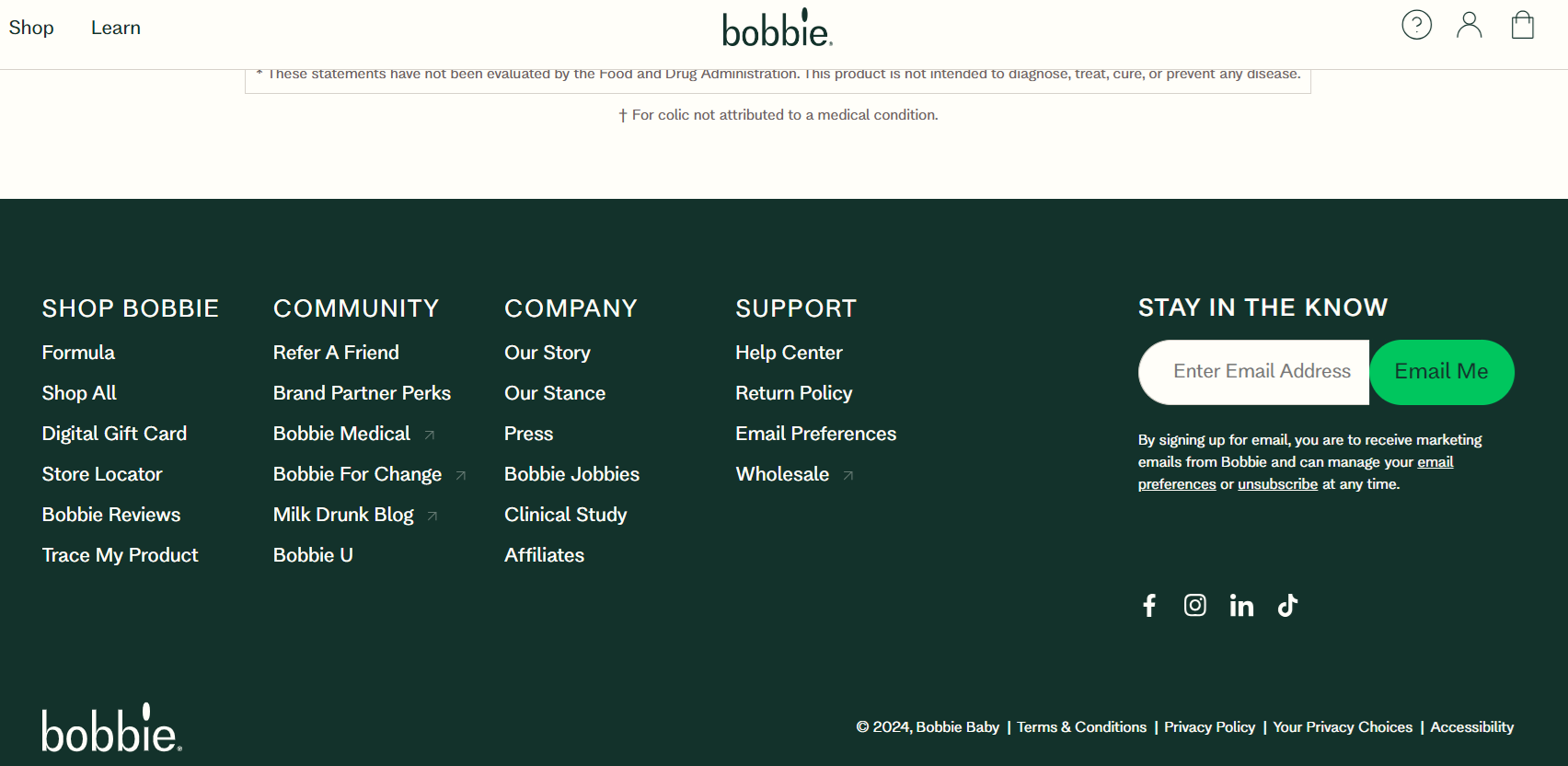
| Bonus Tip: Use the footer menu to link to other key pages across the site, like Home, About, Shop, Contact, and others to boost SEO. |
Final Thoughts
To sum up, your food and beverage website's navigation should be tailored to meet your unique brand style and the needs of your visitors.
Standard horizontal menus are great for a straightforward, familiar navigation experience, and are great if combined with hamburger menus for a responsive design. Mega menus are ideal for displaying extensive product lines and capturing attention. Hover menus offer a dynamic and engaging way to present navigation options, while vertical sidebars make your site stand out from the competition, and can be combined with other menu types.
Don't forget to add breadcrumb navigation to show users their path, and maximize the potential of your footer menu without crowding the main navigation.
Consider your site's content, user preferences, and business goals when deciding on the best navigation style to enhance user satisfaction and drive conversions.
Wondering how to use visual elements to captivate and convert your website visitors? Check out Part 2 of this series, and discover how to effectively implement quality visuals into your food and beverage website design.
