

Great products don't sell themselves—your product page needs to seal the deal. But what if it's falling short?
Picture this: A hungry customer stumbles upon your food business's website. They're drooling over your products, they even add one to their cart. But just when you think you've got the sale, they bail. Ouch. That's a conversion lost in a heartbeat. What made them leave?
Here's the kicker—sometimes it's the little things that make or break a sale. Maybe it's unclear pricing, a complicated checkout process, the page loading too slowly, or just not enough trust. In the e-commerce world, these tiny missteps can cost you big. That's why nailing your product pages is a must.
In our last couple of posts, we talked about why Navigation is key to guiding your customers and how Quality Visuals are your secret weapon to hook them in. Now, we're turning up the heat. This post is all about what it takes to turn those clicks into cash. Starting from what shoppers expect on product pages, and then leading you through all the important elements of a product page, we reveal all the things you need to make your product pages irresistible and drive those conversions home.
Let's dig in.
What Food Shoppers Expect from Your Product Page
When it comes to food and beverage shopping online, customers have high expectations for what they find on your product pages. They're not just browsing—they’re looking for clear, trustworthy, and engaging content that makes them feel confident about their purchase. In an industry where taste and quality are paramount, your product page needs to do more than just inform—it must connect emotionally, build trust, and make the buying process as seamless as possible.
To meet customers' expectations, your product pages must address three underlying needs that make shoppers feel confident, informed, and emotionally connected to your products:
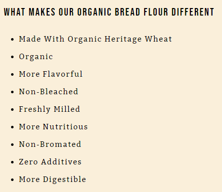
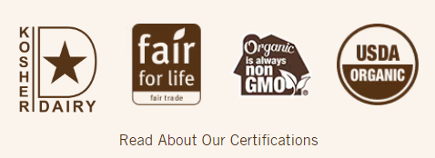
- Trust: Consumers need to trust what they're buying, especially when it comes to food. This trust can be built through transparent product information, clear labeling of ingredients, and certifications (e.g., organic, non-GMO). Any ambiguity or lack of detail can lead to hesitation, and hesitation often leads to a lost sale.
- Clarity: Clarity in product descriptions, pricing, and availability is key. Food shoppers want to know exactly what they're getting—whether it's the flavor profile, nutritional content, or serving size. The more precise and straightforward the information, the more likely consumers are to feel confident in their purchase decision.
- Sensory Appeal: Unlike other products, food needs to appeal to the senses. High-quality visuals that highlight the texture, color, and presentation of the food are essential. Descriptions that evoke taste, smell, and even the feeling of consuming the product can bridge the gap between the digital experience and the physical enjoyment of the product.
Understanding these needs is essential because they are woven into the very fabric of your product page elements. In the next section, we'll dive into the nuts and bolts of your product pages. All these elements are designed with those key needs in mind, making sure your pages don't just grab attention but also turn visitors into loyal customers.
9 Essential Elements of High-Converting Product Pages
Creating product pages that convert is crucial for any eCommerce business aiming to boost sales. But what really makes a product page successful? How do you grab a customer's attention, earn their trust, and get them to click "buy"?
In this section, you'll discover the key elements that turn a product page into a powerful tool for driving sales. Let's dive in and see what it takes to create pages that truly work for your business.
Element #1: Emotions
Consumers don't just buy products; they buy experiences and feelings. When you connect with your audience on an emotional level, you're speaking directly to the part of their brain that influences their decisions. This makes them more likely to trust your brand and take action.
To use emotional triggers effectively, you need to really know your audience. What are their pain points? What do they crave? For instance, in the food and beverage industry, your audience might respond well to triggers related to nostalgia, trust, or the joy of shared experiences. Emotional triggers work by responding to your customers' desires, making your marketing feel personal and relevant.
Which emotional triggers can be used in product pages?
- Happiness 😄
- Use happy visuals and upbeat language to create positive vibes around your product. Show people enjoying your food or beverage, and emphasize pleasure and satisfaction. For example, images of friends laughing over a shared meal can make your product more appealing.
- Empathy and Connection 🤗
- Connect with your audience by addressing their needs and challenges. Tell stories that resonate with their experiences, like how your product solves a common problem. This builds a bond and makes them feel understood, increasing the likelihood of a purchase.
- Nostalgia 🧸
- Tap into warm memories by using imagery and words that remind customers of the past, like childhood treats or family dinners. Nostalgia can make your product feel comforting and familiar, encouraging customers to buy for the sake of reliving those moments.
- Guilt and Redemption 😔
- Play on feelings of guilt by offering your product as a way to make better choices. Highlight how your product is a healthier, more ethical option, helping customers feel good about their decision and easing their guilt.
- Fear of Missing Out (FOMO) 😱
- Create urgency by making customers feel they might miss out on something special. Use phrases like "Limited time only" or "Only a few left" to push them to act quickly, turning hesitation into action.
- Trust 🤝
- Build trust by being transparent and reliable. Show clear product details, customer reviews, and guarantees to reassure your audience that they're making a safe and smart choice.
Don'ts for Using Emotional Triggers in Marketing
❌ Don't Manipulate: Steer clear of being manipulative. Your audience will pick up on it. Authenticity is key—don't promise more than you can deliver.
❌ Don't Overload: Don't throw too many emotional triggers at once—it can overwhelm your audience. Keep it simple and focused. For a landing page, one or two strong emotions will do the trick.
❌ Don't Ignore Cultural Differences: Be mindful of different cultures and how they might react to your messaging. What works in one market might flop in another.
❌ Don't Be Inconsistent: Make sure your emotional messaging is consistent across all your channels. Mixed signals can confuse your audience.
❌ Don't Rely Solely on Negativity: While emotions like fear or urgency can be powerful, don't rely only on negative emotions. Balance them with positive ones to maintain a healthy brand image.
To sum up, emotions should be seamlessly woven into all other elements of your product pages to create a cohesive and compelling shopping experience. Let's start by looking at how to integrate this emotional appeal right from the beginning, with your Product Titles.
Element #2: A Catchy Product Title
Your product title is the first copy visitors see when they land on your page, so it needs to stand out. A strong title grabs attention, highlights a key benefit, and makes it hard for anyone to scroll past without wanting to learn more.
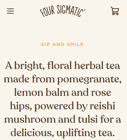
Think of your product title as a headline—it's got to be catchy, clear, and packed with value. Instead of just naming your product, focus on what makes it special. For example, rather than "Organic Honey," try something like "Pure Organic Wildflower Honey – 100% Raw & Unfiltered." This not only tells customers what it is but also why they should care.
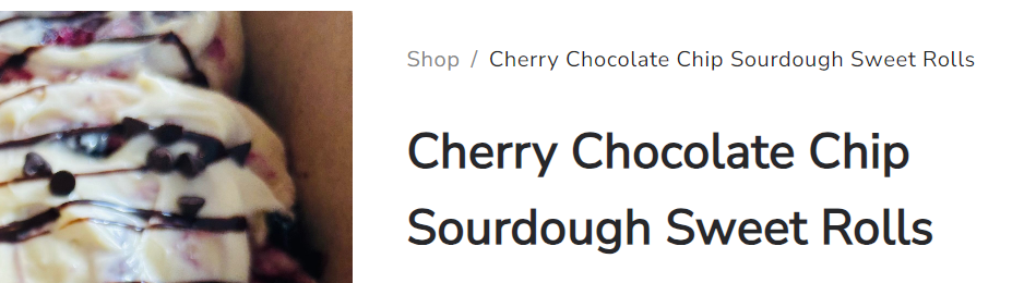
Here's another good example of a delicious product title:
Your goal is to make your product titles impossible to ignore. They should immediately tell visitors what's in it for them, whether it's a unique benefit, a standout feature, or something they just can't resist checking out.
Element #3: An Irresistible Product Description
Once you've grabbed your visitors' attention, the next important factor in turning them into customers is your product description. Since people can't taste or smell your food online, your description has to bring those senses to life. You want them to almost taste that rich chocolate or smell the fresh-baked bread just by reading your page.
That's why this is your chance to show them why your product is the best choice. Whether they're after something organic, a quick snack, or just something really tasty, you need to make them crave what you're offering before they even think about clicking "Add to Cart."
So, how do you pull this off? The key is in storytelling. It's not just for books—it's a powerful tool in marketing that can make your product pages come alive.
By weaving your product into a bigger story or experience, instead of just listing ingredients or features, you create something that's relatable and memorable. You don't just bombard them with information, but you rather create an emotional connection, making the customer feel like they're part of the experience. And when they can see themselves in the story, they're far more likely to hit that "buy" button.
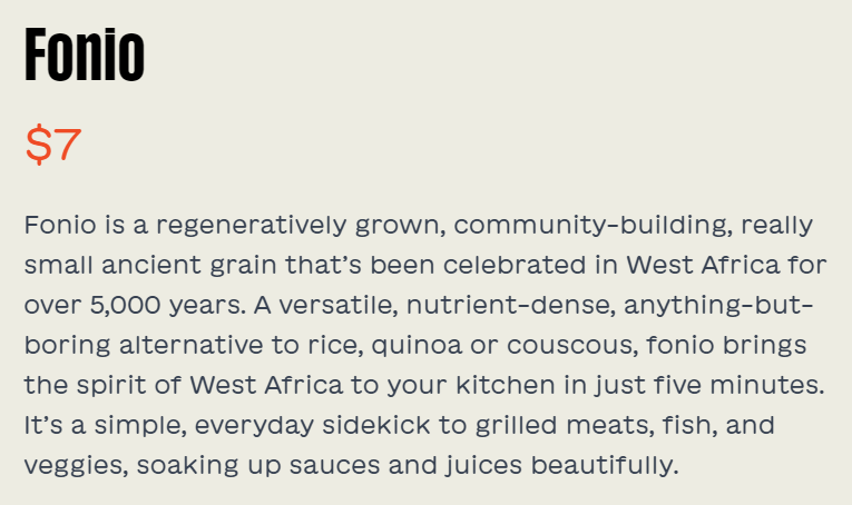
Here are some practical tips and examples of how to make your descriptions pop:
- Be Detailed but Keep It Simple: Give enough info to answer any questions, but don't overload them with too much detail. Focus on what's important: ingredients, flavor, and what makes it special.
- Use Sensory Words: Make your product feel real with words that evoke taste, smell, and texture. For example, instead of "buttery croissants," try "light, flaky croissants with a rich, buttery flavor that melts in your mouth."
- Highlight the Benefits: Show why your product is better. Is it organic? Is it made with a family recipe? Whatever sets it apart should be front and center.
- Make it SEO Friendly: Slip in some keywords naturally to help your product get found online. This way, when someone's searching for what you're selling, they'll find you.
These descriptions don't just tell you what the product is—they make you want to taste it, feel it, and experience it. That's what a great product description does: it bridges the gap between the screen and the senses, making your product irresistible to customers.
Element #4: Mouthwatering Visuals
Great Visuals are a critical element of your product pages, especially in the food and beverage industry. They aren't just there to make your page look good—they're essential tools for driving conversions. Images, videos, and interactive elements can immediately grab a customer's attention, evoke emotions, and ultimately influence buying decisions. This is especially true in the food industry, where a mouthwatering image can create an instant craving.
Element #5: Transparency
Pricing transparency is a make-or-break factor for conversions. Customers want to know exactly what they're paying for, with no surprises at checkout. Hidden fees, unclear pricing, or complicated cost structures can lead to frustration and cart abandonment, driving potential buyers away.
If a customer feels like they’re getting all the information they need upfront, they're more likely to move forward with their purchase. On the flip side, if the final cost is higher than expected due to hidden fees or additional charges, it can erode trust and lead to an abandoned cart.
Best Practices for Transparent Pricing
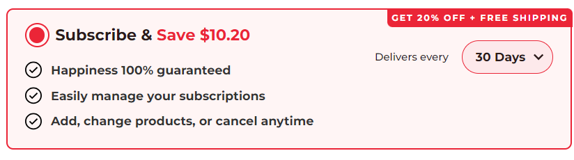
🧾 List All Costs & Details Clearly: Ensure that all costs are visible from the start—this includes taxes, shipping, and any other potential fees. If your product comes with different pricing options (like various sizes or subscription tiers), make sure these are easy to understand. Use simple language and clear formatting to present all available options without overwhelming the customer.
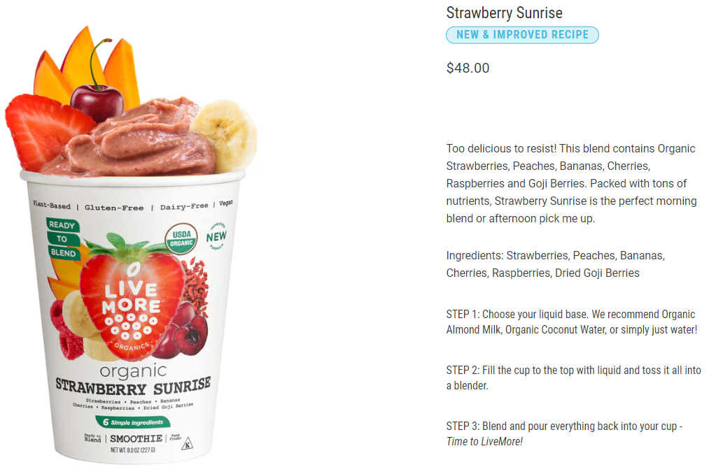
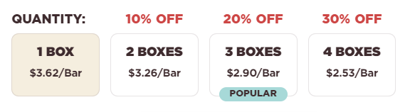
⚓ Use Price Anchoring: Displaying the original price alongside a discounted price, or showing a "per unit" cost for bulk items, can help customers understand the value they're getting. This tactic, known as price anchoring, is effective in making customers feel like they're making a savvy choice by purchasing your product. For example:
🚚 Highlight Free Shipping or Discounts: If you offer free shipping or special discounts, make sure these benefits are clearly visible on your product page. This not only adds value but also encourages customers to complete their purchase knowing they're getting a good deal.

💸 Be Honest About Delivery Costs & Times: Don't wait until the last step of checkout to reveal shipping costs or delivery times. Clearly stating this information on the product page helps manage customer expectations and reduces the chances of cart abandonment due to unexpected charges or delays.
By following these best practices, you can create a more transparent and trustworthy shopping experience, reducing cart abandonment and boosting conversion rates. Transparent pricing isn't just good ethics—it's smart business.
Element #6: Trust
Trust is everything when it comes to shopping online, especially in the food and beverage world. If your customers don't trust you, they're not going to hit that "Buy Now" button—no matter how great your product looks. Building trust reassures customers that they're making a good choice, and it's essential throughout their entire journey on your site.
Think about it: when someone shops online, they're taking a bit of a leap of faith. They need to believe that the product will live up to their expectations, that their payment details are safe, and that the delivery will arrive on time. If they have any doubts, they're much more likely to abandon their cart. That's why establishing trust from the get-go is crucial if you want to boost your conversion rates and keep customers coming back.
How to Build Trust on Your Site
🛡️ Show Off Trust Badges: Trust badges are like little security blankets for your customers. Display them prominently near your CTA buttons or at checkout. Whether it's SSL certificates, secure payment icons, or endorsements from well-known third parties, these badges tell your customers they're in safe hands.
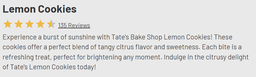
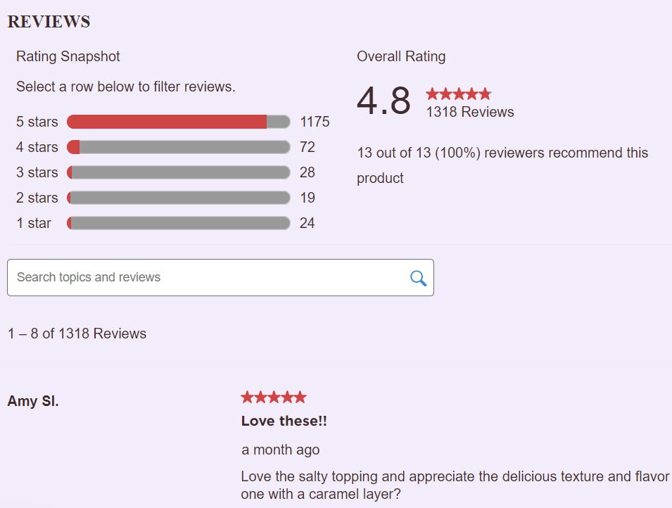
⭐️Use Social Proof: Let your happy customers do the talking! Display reviews, ratings, and testimonials right on your product pages. This shows new customers that others have had a great experience, which makes them more likely to trust you too. Even better, if you've got awards or recognitions, flaunt them—they add extra credibility.
📜Keep Policies Clear and Simple: Nobody likes surprises, especially when it comes to returns or shipping costs. Make sure your return, refund, and shipping policies are clear, upfront, and easy to find. When customers know exactly what to expect, they feel more secure about making a purchase.
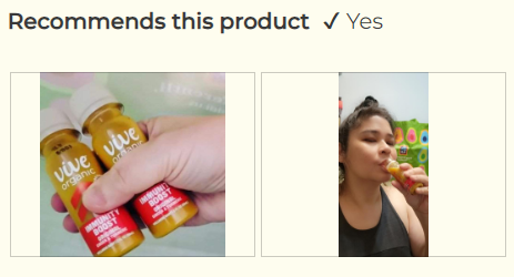
📸 Share Real Customer Photos: Authenticity goes a long way. Including photos of real customers using your products can make your brand feel more relatable and trustworthy. It helps potential buyers picture themselves enjoying your products.
📞 Be Easy to Reach: Make sure your contact information is easy to find. Whether it's a phone number, email, or live chat, showing that you're accessible and ready to help gives customers peace of mind. It reassures them that they can reach out if something goes wrong.
By following these tips, you'll create a shopping experience that feels secure and trustworthy, encouraging customers to confidently make their purchases and come back for more.
Element #7: A Sense of Urgency
Creating a sense of urgency on your product pages is a powerful way to motivate customers to make a quick decision. When people feel like they might miss out on something great, they're much more likely to take action—like adding to their cart or completing a purchase. In the fast-paced world of online shopping, urgency can be the push that turns a casual browser into a buyer.
Tips for Creating Urgency
🔖 Highlight Limited Stock & Scarcity: Scarcity drives urgency by making customers feel like they're getting something exclusive. Display messages that highlight the scarcity of your product, like "Only 5 left!" or "Limited availability—don't miss out!" This tactic is especially effective when combined with real-time inventory updates that show how quickly stock is depleting.
⏱️Use Countdown Timers & Time Sensitive Discounts: Nothing says "act now" like a ticking clock. Adding a countdown timer for limited-time offers or flash sales creates a visual cue that time is running out, encouraging quick decisions. Use time-sensitive discounts like "20% off for the next 24 hours" to create a sense of urgency. This not only boosts sales but also encourages customers to act fast to snag the deal.
❄️Promote Seasonal or Limited-Edition Items: If you're offering a seasonal product or a limited-edition flavor, make sure to shout about it! Phrases like "Available for a limited time only" or "Get it before it's gone" can make customers feel like they need to grab the product while they still can.
Element #8: A Clear Call to Action
Now that you've built trust and added a sense of urgency, it's time to point your customers in the right direction — to the checkout. Call-to-action buttons are crucial for boosting your conversion rates. So, don't let anything stand between your customer and the "Add to Cart" button!

It may seem like a no-brainer, but you would be surprised how many businesses suffer from low conversion rates because of poor CTAs (e.g. "CLICK HERE!"). Often, the CTAs are either too subtle, blending into the page, or buried under text and images, making them hard to spot. This confusion can frustrate customers who might otherwise be ready to buy. On top of that, CTAs that lack urgency or are difficult to interact with on mobile devices can cause even more drop-offs, costing businesses conversions that should have been easy wins.
How to create strong CTAs
✅ Keep things simple and clear. Your CTA should stand out without clashing with the rest of your page—think bold, but not gaudy.
🎯 Use direct, action-oriented language like "Buy Now" or "Add to Cart" and make sure it's easy to find, preferably above the fold.
🏃♂️ Creating a sense of urgency, like "Limited Stock" or "Order Today," can also drive more immediate action.
📲 Ensure your CTA is mobile-friendly, so it's just as easy to click on a phone as it is on a desktop.
By following these best practices, you'll guide your customers smoothly through the buying process, boosting your conversion rates.
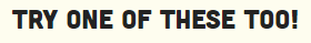
Element #9: Recommendations
Cross-selling and upselling are powerful strategies to maximize the value of each customer interaction on your product pages. When done right, these techniques not only increase your revenue but also enhance the customer's shopping experience by offering them more of what they want or need.
Cross-selling suggests complementary products that go hand-in-hand with the item they're already interested in, for example:
Upselling offers a higher-end version or an upgrade of the product. For example, if a customer is buying a gourmet coffee maker, you might cross-sell premium coffee beans or offer an upsell for a bundle that includes a grinder and accessories.
These strategies work because they tap into the customer's desire to get the most out of their purchase. When you present additional, relevant options, it feels like a natural extension of their original choice, rather than an extra expense.
Best Practices for Cross-Selling and Upselling
📌 Keep It Relevant: The key to successful cross-sells and upsells is relevancy. The products you recommend should be closely related to what the customer is already buying. For instance, if someone is purchasing a bottle of wine, suggest a matching wine opener or a gourmet cheese pairing. Irrelevant recommendations can feel pushy and may even drive customers away.
⚖️ Don't Overdo It: It's important not to overwhelm customers with too many options. Focus on one or two strong recommendations rather than a long list of items. This keeps the shopping experience smooth and doesn't overwhelm the buyer with choices.
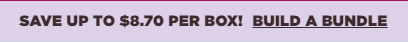
🎁 Use Bundling to Add Value: Bundling related products together at a discounted price is an effective upsell strategy. For example, in the food and beverage industry, you might offer a bundle of gourmet pasta, sauce, and olive oil at a slightly reduced price. This not only encourages customers to spend more but also makes them feel like they're getting a better deal.
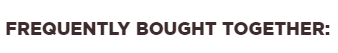
❤️ Highlight Customer Favorites: People are more likely to be swayed by social proof. Highlight products that are frequently bought together or best-sellers in the upsell suggestions. Mentioning phrases like "Customers also bought" or "Popular with other shoppers" can make your recommendations more appealing.
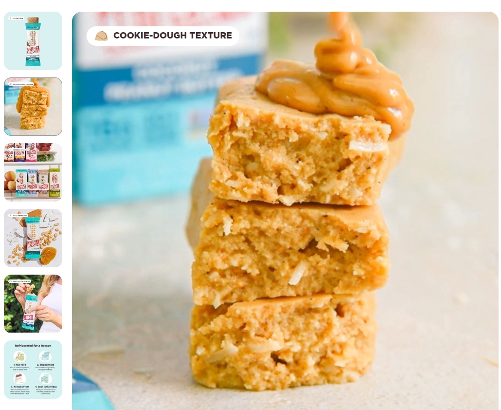
🛒 Make It Easy to Add: The easier it is for customers to add these additional items to their cart, the better. Use clear, compelling CTAs like "Add to Cart" or "Upgrade for Just $X More" to make the decision process simple and quick. For example, Perfect Snacks uses this interactive element which makes it so engaging and irresistible to click:

By incorporating these cross-selling and upselling strategies into your product pages, you can enhance the shopping experience while boosting your average order value. It's all about offering customers more of what they love, in a way that feels natural and beneficial to them.
Final Thoughts
In the world of eCommerce, especially in the food and beverage industry, creating high-converting product pages isn't just about listing products—it's about connecting with your customers on an emotional level. Throughout this blog post, we've explored how critical elements like emotions, trust, and clarity intertwine to create a shopping experience that resonates with your audience.
By strategically integrating these emotional triggers into every aspect of your product pages—whether it's through compelling product titles, descriptions or mouthwatering visuals—you're not just selling a product; you're crafting a narrative that draws customers in and makes them feel understood. When you pair this emotional connection with practical elements like strong CTAs, cross-sells, and upsells, you're not just meeting customer expectations—you're exceeding them.
By following these strategies, food and beverage e-commerce businesses can cook up product pages that not only catch the eye but also convert browsers into loyal customers. Remember, in the digital marketplace, your product page is your storefront – make it a place where customers want to linger, explore, and ultimately, make a purchase.
