Captivating at First Sight
Did you know that the colors, shapes, and images on your website can significantly influence customer behavior and buying decisions? It’s true—people form an opinion about your site in a matter of milliseconds! This lightning-fast judgment is primarily driven by visual elements, making them crucial in web design.
Visuals can evoke emotions and create connections with your audience in ways that text alone cannot. Using visual elements strategically is like setting up eye-catching displays in a physical store. Great visuals don’t just grab attention; they also showcase your brand's personality, help users find their way around, and decide if they'll stick around or leave.
If you already have effective website navigation in place as the foundation for a successful website, the next step is to focus on selecting and using visual elements in order to convert visitors. So, let’s get started on making your food website not just a feast for the eyes, but a powerful tool for driving engagement and conversions.
How Visuals Influence Customer Behavior
Imagine walking past a bakery with the aroma of freshly baked bread wafting through the air and a display filled with colorful pastries. Instantly, you're drawn in. A food website should have the same effect. Ever noticed how some food websites make you hungry just by looking at them? It's not magic—it's a well-planned strategy grounded in marketing psychology.
Visuals play a significant role in how we perceive and interact with online content. In the food and beverage industry what makes food visually appealing often translates directly into web design. Appealing visuals can stimulate appetite, evoke sensory experiences, and create a strong desire for the product.
But, why is that so?
Studies suggest that about 65% of individuals are visual learners and that the human brain processes images 60,000 times faster than text. This means that great pictures can tell the story of your products better than words, as they can quickly capture attention and persuade people to buy.
The relationship between human psychology and visual design gets even more interesting when we look deeper. Understanding why visuals matter in food website design can help you craft an experience that not only captures attention but also drives conversions. Let’s focus on a few points for this blog post: first impressions, colors, and psychological triggers, and look at some real examples.
Psychological Triggers
People make impulsive decisions based on what they see. When you land on a website, you decide if you like it within just a few seconds. This is because our brains are wired to respond to visual information very quickly. If a website has bright, appealing pictures and a nice layout, it will make visitors feel good about the site and the products it offers at first sight.
Visual triggers are specific elements that can influence our behavior and buying decisions. These triggers can include colors, shapes, imagery, and layouts that our brains respond to in certain ways. For instance, colors like blue can instill a sense of trust, while red can create urgency. Shapes like circles can feel friendly and inclusive, while sharp angles might convey strength and stability.
Let’s illustrate this with an example from a well-designed food website, like that of Live More Superfoods. It effectively uses imagery to reflect its brand ethos of organic, farm-to-table smoothies. This brand’s signature raspberry color isn’t just eye-catching—it’s a deliberate choice to evoke a sweet and tangy sensation, making customers’ mouths water even before they taste the product.
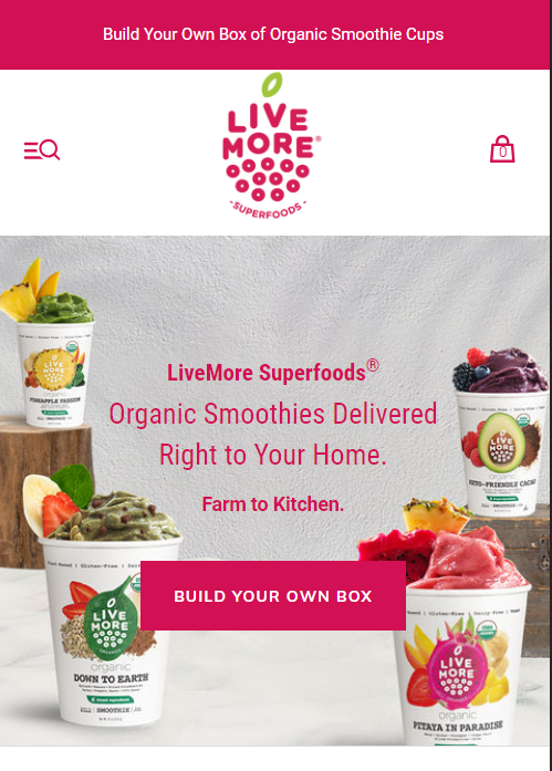
The clean and inviting design, combined with clear and large images of smoothie cups full of fresh fruit, ensures that visitors understand the product offerings immediately and crave them.
By understanding these psychological triggers, you can design a website that not only attracts visitors but also engages them deeply and drives them toward desired actions, whether that's exploring your menu, reading your blog, or making a purchase.
Let’s move on to unraveling the different types of visual elements that you can use in your website design.
Types of Visual Elements
1. Color Schemes
In website design, a color scheme is the combination of colors you choose for various elements like backgrounds, text, buttons, and graphics. Color schemes are more than just eye candy – they're powerful tools that can make or break your site's effectiveness. The right palette can evoke emotions, reinforce your brand identity, and guide users through your content. Yet, an irritating color palette can deter people and make them leave quickly.
It’s all related to psychology. To learn all about Color Theory and building color palettes, visit Flux Academy.
| Integration Tips: * Start by defining your primary brand color and build your palette around it. * Use tools like Adobe Color or Coolors to create complementary color schemes. * Apply your colors consistently across your site to ensure a cohesive look. * Remember to maintain high contrast for text readability and use accent colors sparingly to highlight important elements like call-to-action buttons. |
2. Photography
Photography is the cornerstone of visual content in the food and beverage industry. It includes product shots, lifestyle images, and behind-the-scenes photos. High-quality images can trigger a sense of craving and desire, much like seeing a delicious meal in front of you.
Let's look at food website examples like Jinx, which uses a lot of high-quality images showing how dogs enjoy eating their products in real life. Lifestyle images are generally more relatable than plain product images, and utilizing them for maximum effect is a good practice.
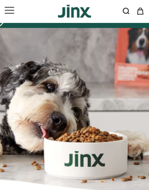
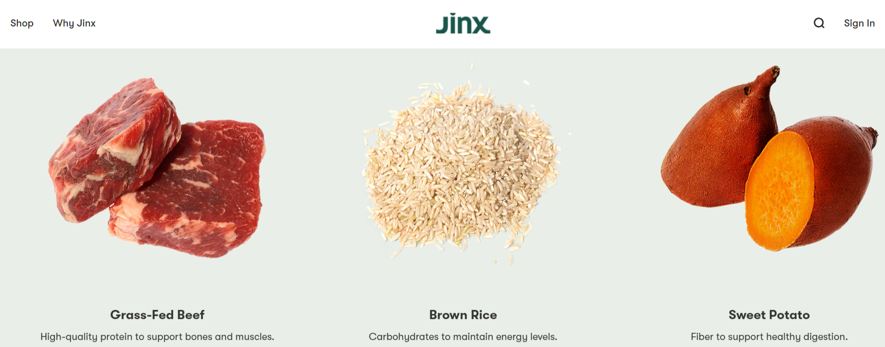
They also use vibrant and dynamic photography of products and their ingredients to highlight their energy and health benefits.
| Integration Tips: * Use high-resolution images that reflect the quality and personality of your brand. Incorporate a mix of product shots, lifestyle photos, and behind-the-scenes images to create a relatable and engaging visual story. * Position key images prominently on your homepage and product pages to capture attention immediately. * Use consistent lighting and backgrounds to maintain a uniform look across all your photos. Employ tools like Lightroom or Photoshop to edit and enhance your images, ensuring they look professional and appealing. * Optimize images for web to ensure quick load times without losing quality. |
3. Videos
Videos are an engaging way to tell your brand story, demonstrate product usage, and connect with your audience on a deeper level. They can include recipe tutorials, customer testimonials, or brand stories. An excellent example is Chomps, which uses videos to tell their organic and sustainable meat story.
Another creative example is Bobbie using video in the background of their homepage engagingly telling their brand story.
| Integration Tips: * Incorporate videos on the most relevant page or pages, such as the homepage, product pages, and the about/our story page. * Use short, engaging clips to maintain viewers' attention and avoid auto-playing videos with sound, as it can be disruptive. * Ensure videos are optimized for fast loading and mobile-friendly viewing. * Embed videos from reliable hosting platforms like YouTube or Vimeo to ensure smooth playback. |
4. Graphics and Icons
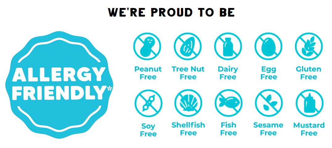
Graphics and icons are essential visual elements of website design. Not only fo they help communicate information quickly and effectively, but they can be used to highlight key features, benefits, or certifications, such as organic or allergen-free labels.
Here’s how Free2b Foods uses simple, yet effective icons to indicate their products are free from common allergens, making it easier for customers to identify the right products.
| Integration Tips: * Use graphics and icons to break down complex information into easily digestible visuals. * Design custom icons that align with your brand’s style and use them to highlight important details like product features or benefits. * Place icons near relevant text or images to reinforce the information and make it easy for users to scan and understand. |
5. Interactive Elements
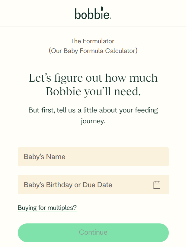
Interactive elements, such as sliders, hover effects, and clickable infographics, are a dynamic part of website visual design. They can enhance user engagement and provide a more immersive experience. Websites like Bobbie use various interactive elements, one of which is this Formulator Quiz that allows users to calculate exactly how much formula their baby would need, by answering simple questions.
| Integration Tips: * Integrate interactive elements that add value and engage users without overwhelming them. * Use sliders to showcase product features or testimonials, and incorporate hover effects to reveal additional information or animations. * Implement interactive quizzes or calculators that provide personalized results and keep users engaged. * Ensure these elements are intuitive and enhance the overall user experience. |
Final Thoughts
In the food and beverage industry, visuals are powerful tools for engaging customers, building brand identity, and driving sales. By understanding the psychology of visual appeal, utilizing various types of visual content, following best practices for photography and graphic design, and optimizing your images for web performance and SEO, you can create a compelling online presence.
Now that you have a comprehensive understanding of how to use visuals to enhance your food and beverage website, it’s time to put these insights into action. Start by evaluating your current visual strategy, identify areas for improvement, and implement the tips from this guide. Take inspiration from some of the best visually appealing websites in the food industry, which seamlessly blend functionality with aesthetics.
By focusing on these 5 visual design elements, you can create a balanced and engaging experience that appeals to your audience while supporting your brand's goals. Your website is your digital storefront – make sure it’s as appealing and engaging as possible.
In our next post about website design, we reveal everything about creating product pages that convert visitors into customers, so keep reading!
